PIA Livery changing soon - Tariq Kirmani
-
PakN'US

- Registered Member
- Posts: 120
- Joined: Tue Aug 30, 2005 2:28 am
- Location: CGX
-
Amaad Lone
- Registered Member
- Posts: 3077
- Joined: Thu Aug 05, 2004 7:10 pm
- Location: Lahore
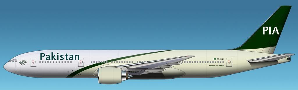
Coyboy, the livery you suggest sucks.
The font on the tail and the fusalage should remain the same.
Plus the small font PIA on the tail does not look nice.
I think the likes and dislikes of Mr.Kirmani should be ignored, and the airline should first see the cost of re-doing the livery and calculate if the cashflow is there for such an endeavour.
After all PIA did just declare a 200 crore loss for the first six months of 2005.
P.I.A
God's International Airline
God's International Airline
-
CoyBoy
- Registered Member
- Posts: 1738
- Joined: Mon Aug 23, 2004 8:13 pm
- Location: Pakistan
All I can say is you have incredibly cheap taste, I'd also much rather have PIA stick with what they have now then the suggestions that have been posted on this forum, with the dozen extra additions that are not needed in the scheme, making the aircraft look like an over dressed aunty ever heard of "less is more", atleast the present one is dignified despite the amateur flag, I think even in the Pashmina scheme which is a classic example of the less is more concept you people must have wanted to add what not to it.
Or they should just go for something bold like Avianca, who dropped their PIAesque dull groupo summa scheme http://www.airliners.net/open.file/825335/M/ and reverted to a colourful NEW look http://www.airliners.net/open.file/918035/M/
Or they should just go for something bold like Avianca, who dropped their PIAesque dull groupo summa scheme http://www.airliners.net/open.file/825335/M/ and reverted to a colourful NEW look http://www.airliners.net/open.file/918035/M/
-
Nasir
- Registered Member
- Posts: 963
- Joined: Thu Aug 05, 2004 7:23 pm

-
Kashif

- Registered Member
- Posts: 99
- Joined: Wed Nov 24, 2004 1:43 pm
- Location: Oslo, Norway
Coyboy, the livery you suggest sucks.
Plus the small font PIA on the tail does not look nice. The font on the tail and the fusalage should remain the same.
I think the likes and dislikes of Mr.Kirmani should be ignored, and the airline should first see the cost of re-doing the livery and calculate if the cashflow is there for such an endeavour.
After all PIA did just declare a 200 crore loss for the first six months of 2005.
Amaad Lone. You should watch your language. You are on the border of flaming. You are participating in an airline forum, not a kindergarden forum. Instead of telling coyboy that the livery he suggest sucks, you could have just said in a nice manner like "I do not agree that this livery will look nice". Manners, man!
-
PK
- Registered Member
- Posts: 8
- Joined: Fri Oct 08, 2004 7:29 pm
-
PakN'US
- Registered Member
- Posts: 120
- Joined: Tue Aug 30, 2005 2:28 am
- Location: CGX
-
piafan
- Registered Member
- Posts: 42
- Joined: Sat May 28, 2005 10:09 pm
I agree that livery presented by Nasir is overworked. Actually It is too patriotic and boring. There is a need to come up with livery that is lively and vivid in nature. I would like to see a livery representing our 4 provinces distinctly in a truly lively and vivid colour scheme. We should think out a the box away from green and white. Perhaps look at different colors that represents 4 provinces of Pakistan. A livery also describing northern areas with a distinct flavour would be nice. The colour scheme could be topped of by giving each Plan a name.Nasir your livery looks overworked, even if you compare it to the bold yet balanced 1980's scheme, much rather them revive the drab original version that debuted on the 777, using new thicker font for Pakistan title and PIA, or even the Pashmina using new fonts and darker greens.
-
Moin
- Registered Member
- Posts: 3165
- Joined: Sun Aug 08, 2004 11:17 am
Personally I think Nasirs designs are by far one of the most classy and eye catching than anything else that has been suggested here by far and certainly a hell of alot better than what the airline currently has. Of course there are those that prefer the 'plain jane' lack lustre color schemes and there are those who don't. I find the Avianca design rather unimaginative and boring and I think its time we moved on from the stale PIA on the tail scheme and the ever so drab euro white.
If you like it, all well and good and if not fine. In the end, its the airline that will decide.
If you like it, all well and good and if not fine. In the end, its the airline that will decide.
Moin Abbasi
-
CoyBoy
- Registered Member
- Posts: 1738
- Joined: Mon Aug 23, 2004 8:13 pm
- Location: Pakistan
-
Gulistan
- Registered Member
- Posts: 83
- Joined: Fri Aug 27, 2004 5:22 pm
-
Nasir
- Registered Member
- Posts: 963
- Joined: Thu Aug 05, 2004 7:23 pm
-
Moin
- Registered Member
- Posts: 3165
- Joined: Sun Aug 08, 2004 11:17 am
Well I for one can't understand why some are getting so over emotional about it. Its not like any of us actually own the airline, but sadly majority of people here act and talk like the airline is their personal property who's image and reputation is at stake.
Someone here submitted their design and like I said if you like it, all well and good and if not, you don't have to resort to all sorts of explicitives if someone disagrees, but then again I guess all that I have just said is water on a duck's back.
Someone here submitted their design and like I said if you like it, all well and good and if not, you don't have to resort to all sorts of explicitives if someone disagrees, but then again I guess all that I have just said is water on a duck's back.
Moin Abbasi
-
stylo4444
- Registered Member
- Posts: 125
- Joined: Sun Sep 26, 2004 4:01 pm
- Location: Orlando, FL